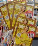
 The cover and accompanying marketing collateral for Cosmopolitan this month stand out, among the best creative I have seen for visually noisy newsagencies in a long time. The yellow is sassy and sells the magazine well. I’d expect a sales lift as a result of the look the team behind the magazine has created. We have placed the posters at the end of the main women’s magazine aisle – shoppers see this as they enter. We also have a half waterfall for the title itself.