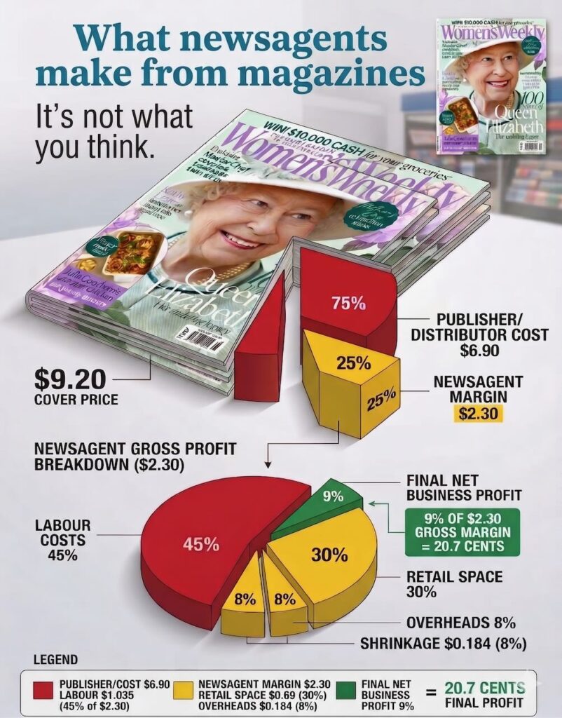
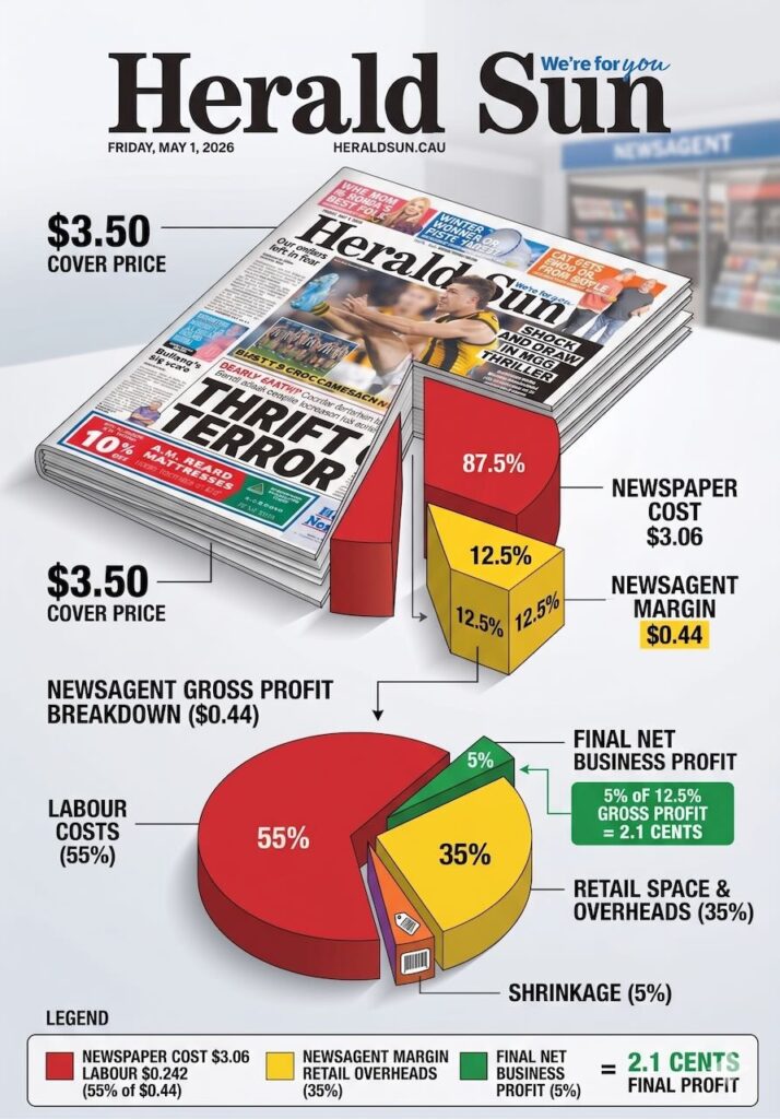
If your loyalty program is not adding measurable value to your business, it’s failing you
I was talking to a newsagent a couple of days ago who is running a loyalty program managed outside of their business. It’s routine work and the newsagent was wondering if it was working. Only the people who control the program have the complete data. So I asked the newsagent if they are making money from it. I don’t know was the answer.
If you don’t know what you’re making from your loyalty program in your business, it’s a failure.
Most small retailers either have no loyalty programme or have one they set up years ago and largely ignore. Both are mistakes, but the second one is the more expensive mistake, because it creates the illusion of doing something without actually achieving anything.
A loyalty programme that nobody talks about, that staff forget to mention, and that customers have stopped caring about is not a loyalty programme. It is administrative overhead with a card attached.
Here is what actually drives repeat visits.
Recognition beats points
Customers come back to businesses where they feel known. Not to businesses where they are accumulating theoretical discounts they will eventually redeem on something they do not particularly want.
If your loyalty programme is purely transactional — spend this, earn that — it is doing less than you think. The retailers with strong repeat trade are the ones where staff know customers by name, remember what they bought last time, and make them feel like their visit matters.
That is not a technology problem. It is a culture problem.
The redemption trap
Many loyalty programmes are designed around a reward that is too far away to feel real. Spend $500 to save $10. Collect 20 stamps to get a free item. These mechanics do not change behaviour. The gap between spending and reward is too wide for most customers to stay engaged.
If you want a programme that actually works, shorten the loop. Make the reward feel achievable. A customer who earns something within two or three visits is more motivated than one chasing a reward that is six months away.
Your best customers do not need a points card
Think about who your most loyal customers actually are. They come in regularly, spend well, and send people your way. They were coming before you had a programme and they will keep coming regardless.
The loyalty programme is not for them. It is for the customers in the middle, the ones who visit occasionally and could visit more. That is the group worth targeting. Design your programme around converting occasional customers into regulars, not rewarding people who are already regulars.
Staff are the programme
The single biggest driver of repeat visits in small retail is how customers feel when they leave. If they leave feeling good about the interaction, they come back. If they leave feeling ignored or rushed, they might not.
Your staff are more powerful than your points system. Train them to engage. Make sure they mention the programme at the right moment — not as a script, but as a genuine offer. If your team cannot explain the programme clearly in one sentence, simplify the programme.
What to do
Pull the data on your current programme if you have one. How many active members do you have? How many have redeemed something in the last 90 days? What is the average time between visits for members versus non-members?
If you cannot answer those questions, the programme is not being managed. If you do not have a programme, the question is not whether to have one — it is what behaviour you want to change and what incentive is proportionate to that change.
Start there.
Now for the newsagent I mentioned at the start of this post, my advice was to demand access to the data from those at the top of their pyramid. That’s the start to understanding if all the busy work in the shop is worth it.


