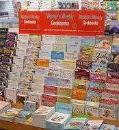
 We are trialling new signage from ACP for their Women’s Weekly Cookbooks. While I like the look, I was concerned that it may block sightlines to aisles behind the cookbooks, as seen from the counter. Now that it is in place, I don’t see this as much of a concern.
The bold signage draws attention to the cook the cookbook offer and reinforces the connection with the Women’s Weekly brand. It cuts through the sea of colour which confronts shoppers in the magazine aisle.
The plan is to leave this signage in place until the New Year at least.