We are preparing to open a business a new location in a high street situation in suburban Melbourne.
As part of the process of preparing the business we have been looking at our messaging inside and outside the shop. We wanted messaging that reflected the style and emotion of the business.
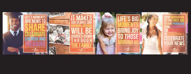
Here is art we are using for the first three months. I say three months as we will be chasing the art regularly.
This poster will run across the lower part of the front window, facing the street, as well as inside the store. It is not the only positioning collateral we are using. I will save those photos for another time.
While trading under a brand, major international product brands feature on the shingle and elsewhere in the business. These, coupled with the emotion-focussed posters above, pitch the business in a fresh way and in my view a better way than a newsagency shingle would.
The shop itself was a card shop until the owner put it into administration just before easter. We had a day to make a decision and move, which we did, acquiring the business from the administrator. The shop will open sometime next week and evolve over the next few months as we play with fresh ideas before we settle on what the model actually looks like.
This will be a hybrid business. It has no lotteries or tobacco products and will only have limited papers and magazines. The shop will primarily offer cards, gifts and collectibles.
What I am doing here, investing in a new retail location, reflects my optimism for the channel, regardless of the shingle under which businesses trade.

I think it is a good concept but the execution incorrect. Using generic US images does not create a connection with people but potentially a disconnect.
Just my opinion.
Good luck in your new venture, very exciting getting a blank canvas.
Chris it is part of the goal to present non-cliche images for the Australian shopper. The only image you could possibly class as US is on the left.
The canvas is not that blank at the moment as we are opening with the fit the previous card and gift shop had, to learn what locals like, before we then create a bolder step.
Enjoying a few days away in SA. Too many in the channel taking your last comment literally with no change to shingle since some time mid last century.
Good luck, hope it goes well.
https://badnewsagent.wordpress.com/2017/04/30/back-in-2012-you-were-being-told/
Interesting point of view
I don’t know who is behind that blog Andrew. They using some content from here without seeking my permission.
Whilst the site has a vindictive undertone perhaps written by someone who failed in our sector….. This latest blog is a fair comment. Maybe he or she is mellowing.