I like this wall I saw earlier this week displaying magazines and newspapers together. I like it for the professional look, ease of browsing, how it makes the products the hero that the fixtures are flexible, that it works on any wall to attract shoppers to this location, and the pitching of papers and magazines together.
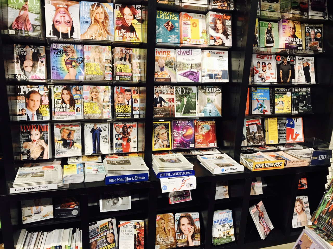
The placement of small-format titles between papers is smart.
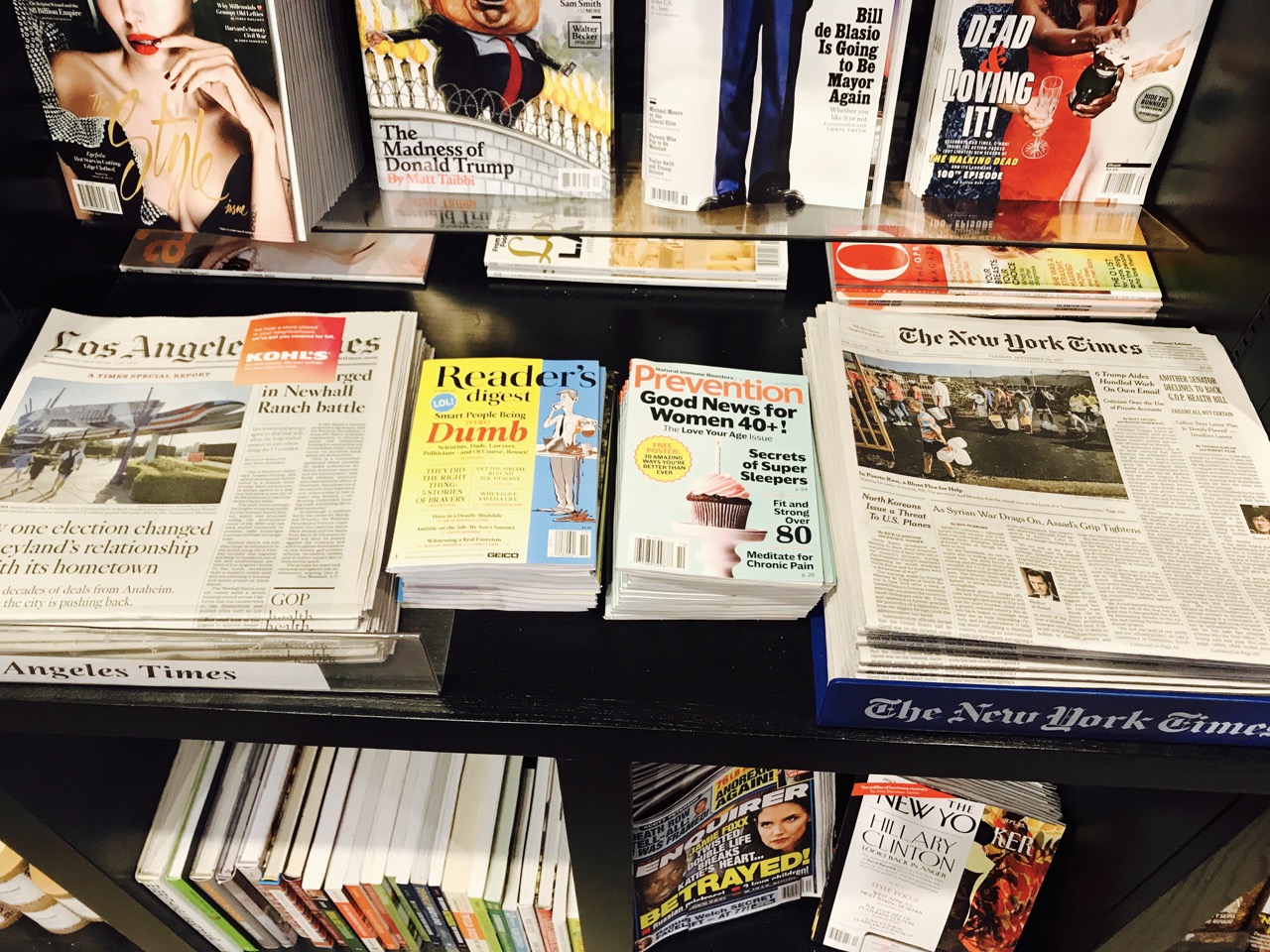
The black fixture makes the magazine covers pop.
I could see a wall like this on the back wall of a newsagency working better than the old style a-frame magazine units that still occupy centre stage of some newsagencies.
Sure, the wall cannot hold as many titles, but with thoughtful placement, a wall four metres wide could work.
While magazines are challenged, they continue to be an important traffic driver for many newsagency businesses. As such, it is important newsagents continue to evolve how the category is ranged and pitched in-store.
Looks great. Not sure about introducing black fixtures, flexibility is key and black is not the best merchandising background.
Black can be great for colourful product. Britto, coloured glassware even soft toys. The more colourful they are the better they pop on black so there is certainly a place for some versatile black fitting in any store.